Following on from the previous post on using flexboxes for layouts, we will now add grids to our repertoire.
Did you notice in our web page how it was broken up into sections? There was a title, a banner, content, news and a footer. Wouldn’t it be nice to structure this properly? It would also be nice if some of the main content didn’t stretch across the whole page but instead was constrained to a smaller area for greater readability.
Fear not, this is where CSS grids can come in handy!
I’m just going to go through this quickly. Take a look at A Complete Guide to CSS Grid if you want more detail.
First, let’s add some more colours to our style.css so we can distinguish the different sections of the page.
 :root {
    --bg-color: cadetblue;
    --header-bg-color: darkgoldenrod;
    --footer-bg-color: lightsteelblue;
    --footer-text-color: white;
    --main-bg-color: white;
    --main-text-color: black;
    --heading-color: darkblue;
    --news-bg-color: linen;
    --news-text-color: darkgreen;
    --news-item-bg-color: lightgrey;
    --banner-box-bg-color: rgb(256, 256, 256, 70%);
 }Code language: CSS (css)
We are going to use a three column, three row grid. The header and footer will stretch the whole width of the screen, the main content area will be a maximum of 1000 pixels wide and centred. I’ve also added some heights so that the footer stays at the bottom.
We define the page body as the container of the grid and the header, main and footer areas as the grid cells. Update style.css with the following:
body {
    font-family: 'Montserrat', sans-serif;
    background-color: var(--bg-color);
    padding: 0;
    margin: 0;
    color: var(--main-text-color);
    display: grid;
    grid-template-columns: 1fr minmax(min-content, 1000px) 1fr;
    grid-template-rows: 1fr 1fr auto;
    grid-template-areas:
      "header header header"
      ". main . "
      "footer footer footer";
    min-height: 100vh;
}

header {
    grid-area: header;
    background-color: var(--header-bg-color);
}

main {
    grid-area: main;
    max-width: 1000px;
    background-color: var(--main-bg-color);
}

footer {
    grid-area: footer;
    background-color: var(--footer-bg-color);
    color: var(--footer-text-color);
}Code language: CSS (css)
You can see that we set the body to display: grid, and set three columns. The two side columns are 1fr, or each one fraction, while the centre is a maximum of 1000 pixels wide, but will shrink if the browser window size shrinks. The grid rows are set for the header, the body and auto so the footer appears down the bottom.
The grid-template-areas sets the layout of the page.
grid-template-areas:
      "header header header"
      ". main . "
      "footer footer footer";Code language: JavaScript (javascript)
This sets the header and footer to stretch across three columns and puts the main area in between two unlabelled columns.
In header, main, and footer we set the grid-area to the same labels used in the grid-template-areas above.
Try adding an extra unlabelled column by changing:
...
grid-template-columns: 1fr minmax(min-content, 1000px) 1fr 1fr;
...
grid-template-areas:
      "header header header header"
      ". main . ."
      "footer footer footer footer";Code language: JavaScript (javascript)
Now change it back.
You don’t need to make any changes to your HTML!
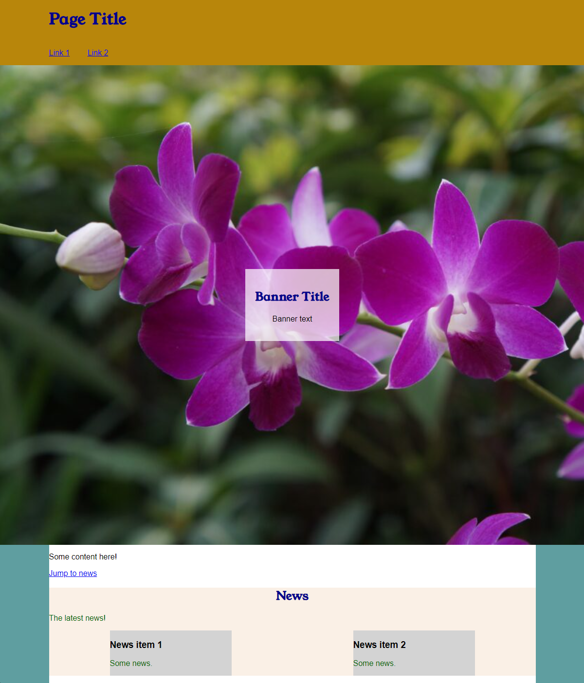
Reload page.html and it should look like this:
It looks a bit odd for the Page Title to be all the way to the left. It should be aligned with the content area. Let’s make a navigation menu too and put the whole header area in its own grid. That’s right, grids within grids!
In page.html change the <header></header> contents to the following:
    <header>
        <!-- Header content, such as title, menu and banner -->
        <div class="site-title">
        <h1>Page Title</h1>
        </div>
        <nav class="menu">
            <ul>
                <li><a href="#">Link 1</a></li>
                <li><a href="#">Link 2</a></li>
            </ul>
        </nav>
        <div class="banner">
            <div class="banner-box">
                <h2>Banner Title</h2>
                <p>Banner text</p>
            </div>
        </div>
    </header>Code language: HTML, XML (xml)
See how we added a menu in <nav> and used a list for the links?
Update style.css with so that the header element looks like this:
header {
    grid-area: header;
    background-color: var(--header-bg-color);
    display: grid;
    grid-template-columns: 1fr minmax(min-content, 1000px) 1fr;
    grid-template-rows: auto;
    grid-template-areas:
        ". site-title ."
        " . menu ."
        "banner banner banner"
}Code language: CSS (css)
Do you see that we added display: grid and a grid template to it?
Now we need to make the .banner class a grid area, so it should now look like:
.banner {
    grid-area: banner;
...
We now add some areas for the site-title and menu to the bottom of style.css and also set the menu list to display inline without bullet points and a left indent:
.site-title {
grid-area: site-title;
max-width: 1000px;
}
.menu {
grid-area: menu;
max-width: 1000px;
}
.menu ul {
list-style: none;
padding-inline-start: 0;
}
.menu li {
display: inline-block;
margin-right: 2rem;
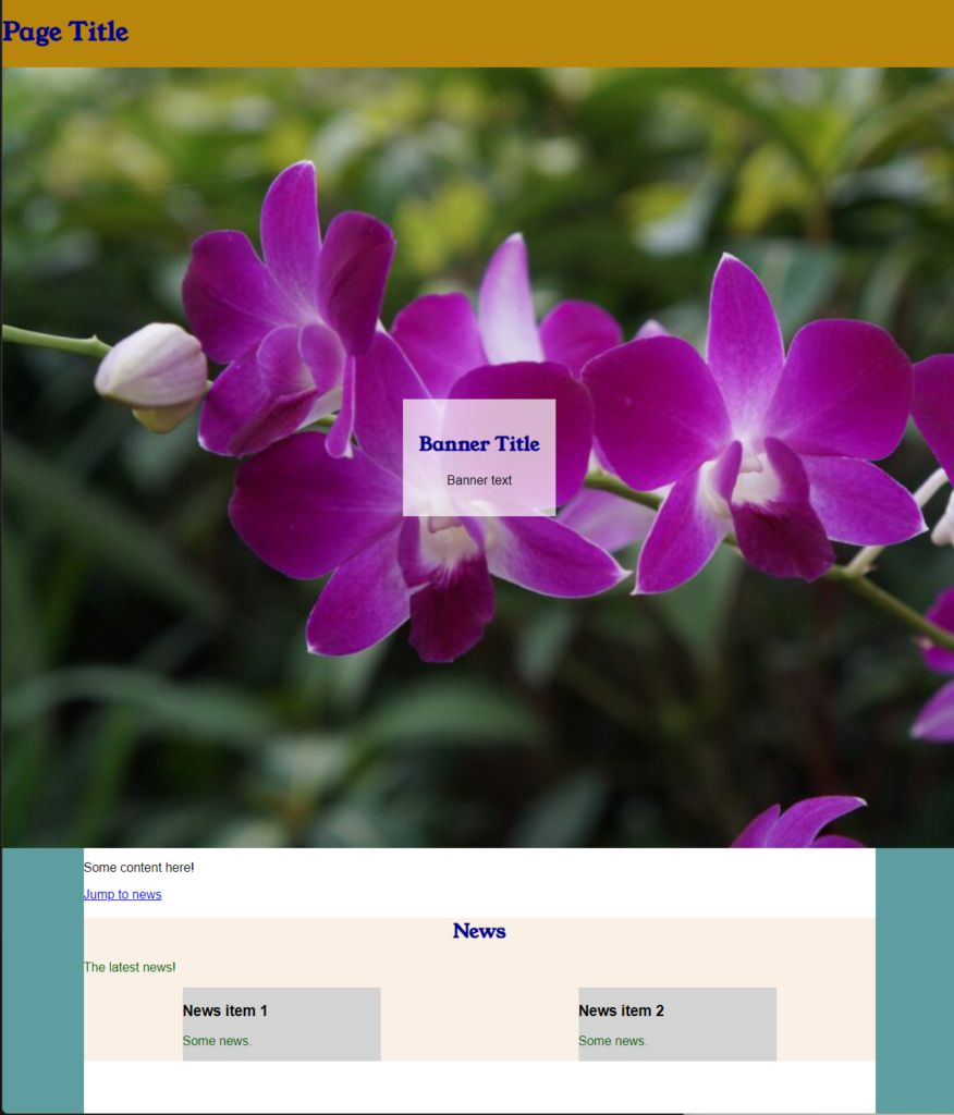
}Code language: CSS (css)Save the CSS and HTML files and reload in the browser. It should look this this:

You might want to make a single row grid for the footer so that it is aligned with the content as well.
Complete files
page.html
<!DOCTYPE html>
<html lang="en">
<head>
<meta charset="utf-8" />
<title>Page Title</title>
<meta name="viewport" content="width=device-width" />
<link rel="preconnect" href="https://fonts.googleapis.com">
<link rel="preconnect" href="https://fonts.gstatic.com" crossorigin>
<link href="https://fonts.googleapis.com/css2?family=Roboto&family=Young+Serif&display=swap" rel="stylesheet">
<link rel="stylesheet" href="css/style.css">
</head>
<body>
<header>
<!-- Header content, such as title, menu and banner -->
<div class="site-title">
<h1>Page Title</h1>
</div>
<nav class="menu">
<ul>
<li><a href="#">Link 1</a></li>
<li><a href="#">Link 2</a></li>
</ul>
</nav>
<div class="banner">
<div class="banner-box">
<h2>Banner Title</h2>
<p>Banner text</p>
</div>
</div>
</header>
<main>
<!-- Main content -->
<section>
<!-- Divide the main content into sections -->
<p>Some content here!</p>
<p><a href="#news-title">Jump to news</a></p>
</section>
<section class="news-section">
<h2 id="news-title">News</h2>
<p>The latest news!</p>
<div class="news-container">
<div class="news-item">
<h3>News item 1</h3>
<p>Some news.</p>
</div>
<div class="news-item">
<h3>News item 2</h3>
<p>Some news.</p>
</div>
</div>
</section>
</main>
<footer>
<!-- Footer content -->
<p>© Me, 2023</p>
</footer>
</body>
</html>Code language: HTML, XML (xml)style.css
/** Styles */

/**
 * Define colours
 */

 :root {
    --bg-color: cadetblue;
    --header-bg-color: darkgoldenrod;
    --footer-bg-color: lightsteelblue;
    --footer-text-color: white;
    --main-bg-color: white;
    --main-text-color: black;
    --heading-color: darkblue;
    --news-bg-color: linen;
    --news-text-color: darkgreen;
    --news-item-bg-color: lightgrey;
    --banner-box-bg-color: rgb(256, 256, 256, 70%);
 }

/**
 * Define main elements
 */

body {
    font-family: 'Montserrat', sans-serif;
    background-color: var(--bg-color);
    padding: 0;
    margin: 0;
    color: var(--main-text-color);
    display: grid;
    grid-template-columns: 1fr minmax(min-content, 1000px) 1fr;
    grid-template-rows: 1fr 1fr auto;
    grid-template-areas:
      "header header header"
      ". main . "
      "footer footer footer";
    min-height: 100vh;
}

header {
    grid-area: header;
    background-color: var(--header-bg-color);
    display: grid;
    grid-template-columns: 1fr minmax(min-content, 1000px) 1fr;
    grid-template-rows: auto;
    grid-template-areas:
        ". site-title ."
        " . menu ."
        "banner banner banner"
}

main {
    grid-area: main;
    max-width: 1000px;
    background-color: var(--main-bg-color);
}

footer {
    grid-area: footer;
    background-color: var(--footer-bg-color);
    color: var(--footer-text-color);
}


h1, h2 {
    color: var(--heading-color);
    font-family: 'Young Serif', serif;
}

.news-section {
    background-color: var(--news-bg-color);
}

.news-section p {
    color: var(--news-text-color);
}

#news-title {
    text-align: center;
}

.news-container {
    display: flex;
    flex-flow: row wrap;
    justify-content: space-around;
}

.news-item {
    background-color: var(--news-item-bg-color);
    width: 250px;
}

.banner {
    grid-area: banner;
    background-image: url('../images/DSC00331-1024x680.jpg');
    background-size: cover;
    width: 100%;
    height: 70vh;
    display: flex;
    justify-content: center;
    align-items: center;
}

.banner-box {
    background-color: var(--banner-box-bg-color);
    text-align: center;
    padding: 20px;
}

.site-title {
    grid-area: site-title;
    max-width: 1000px;
}

.menu {
    grid-area: menu;
    max-width: 1000px;
}

.menu ul {
    list-style: none;
    padding-inline-start: 0;
}

.menu li {
    display: inline-block;
    margin-right: 2rem;

}

Code language: CSS (css)
You must be logged in to post a comment.