This is a brief introduction to using HTML and CSS flexboxes. These are tools to allow you to easily lay out your web page. First, let’s go through a few basic HTML and CSS concepts.
Basic web page
Let’s set out a very basic web page below. This is a semantic layout, which means that the sections have meanings. We will add two Google fonts to this page, Roboto and Young Serif. You can choose different ones.
page.html
<!DOCTYPE html>
<html lang="en">
<head>
<meta charset="utf-8" />
<title>Page Title</title>
<meta name="viewport" content="width=device-width" />
<link rel="preconnect" href="https://fonts.googleapis.com">
<link rel="preconnect" href="https://fonts.gstatic.com" crossorigin>
<link href="https://fonts.googleapis.com/css2?family=Roboto&family=Young+Serif&display=swap" rel="stylesheet">
<link rel="stylesheet" href="css/styles.css">
</head>
<body>
<header>
<!-- Header content, such as title, menu and banner -->
<h1>Page Title</h1>
</header>
<main>
<!-- Main content -->
<section>
<!-- Divide the main content into sections -->
<p>Some content here!</p>
</section>
</main>
<footer>
<!-- Footer content -->
<p>© Me, 2023</p>
</footer>
</body>
</html>Code language: HTML, XML (xml)We will also make a style sheet and put it in a subdirectory called css. We are going to use CSS custom variables for the colours as they are better for reuse.
css/styles.css
/** Styles */

/**
 * Define colours
 */

:root {
    --main-bg-color: white;
    --main-text-color: black;
    --heading-color: darkblue;
    --news-bg-color: linen;
    --news-text-color: darkgreen;
    --news-item-bg-color: grey;
}

/**
 * Define main elements
 */

body {
    font-family: 'Montserrat', sans-serif;
    background-color: var(--main-bg-color);
    padding: 0;
    margin: 0;
    color: var(--main-text-color);

}

h1, h2 {
    color: var(--heading-color);
    font-family: 'Young Serif', serif;
}Code language: CSS (css)
Applying styles
Let’s add a new section to our web page and give it a different background colour (--news-bg-color).
In style.css add the following code at the bottom:
.news-section {
    background-color: var(--news-bg-color);
}Code language: CSS (css)
The dot (.) in front of the news-section says we are making a new “class”. That style will apply to any element we add the class to, which is what we will do next.
Now in page.html add the following section under the existing </section> tag:
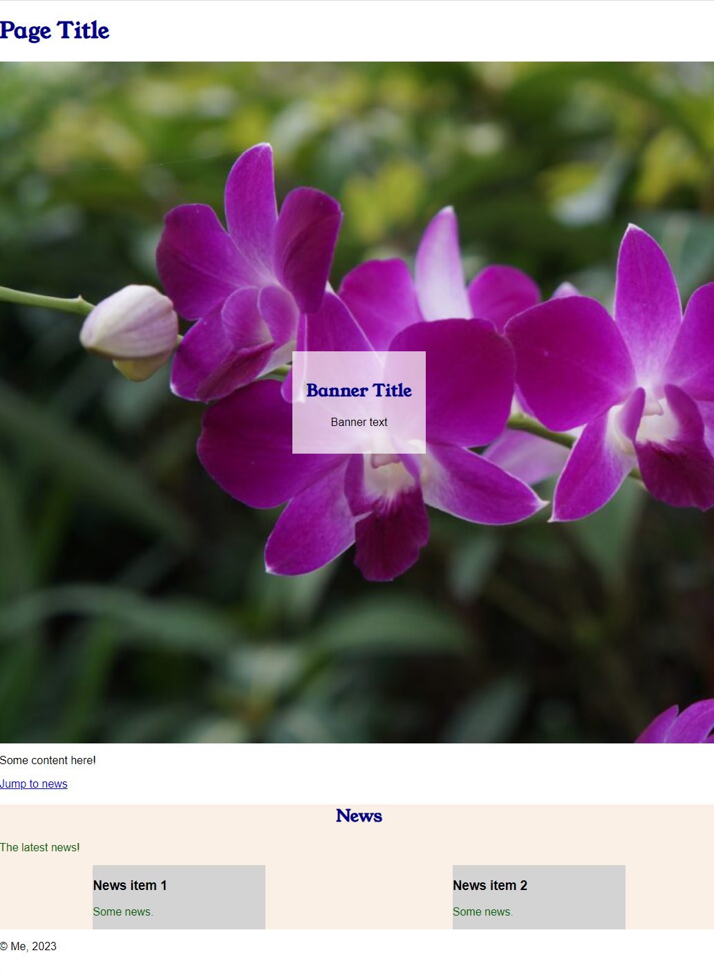
<section class="news-section">
    <h2>News</h2>
    <p>The latest news!</p>
</section>Code language: HTML, XML (xml)
Load the page in your web browser and you should get something like this:
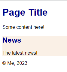
Let’s make the paragraph text inside the news box a different colour. We could create a new class, but in this case we can just define any specified elements inside of that class to have the style.
In your style.css add the following to the bottom:
.news-section p {
    color: var(--news-text-color);
}Code language: CSS (css)
Reload page.html in your web browser and the text should now appear green (I forgot to add the font styles to heading in the first screenshot)!
Notice how the News title is left unchanged? That’s because we only added a CSS rule for the <p> tag in the stylesheet.
Instead of uses classes you can target a specific element by giving in an id attribute, which we can then refer to by prefixing it with “#”. Let’s give the News heading one. In page.html modify <h2>News</h2> as follows:
<h2 id="news-title">News</h2>Code language: HTML, XML (xml)In style.css add:
#news-title {
    text-align: center;
}Code language: CSS (css)
Save and reload and the News titles should now be centred.
Another neat trick is that now you can add a link to that id within the page.
Beneath Some content here! add another line in page.html
<p><a href="#news-title">Jump to news</a></p>Code language: HTML, XML (xml)Click on that link and it should automatically take you to the News section. Except that right now your page is so short that nothing much will happen, but it’s a good trick for later. For instance, if you added the following link in another page it would take you directly to the news section in page.html.
<a href="page.html#news-title">News</a> Code language: HTML, XML (xml)DIVs
Think of your web page as being laid out as a series of boxes and inside those boxes are more boxes or your page content. Your page <html> is one box, inside that are boxes for the <head> and <body>. Inside the <body> and <header>, <main> and <footer> boxes and so on.
The most common box, or container, as they are often referred to is the <div>.
Let’s add a news item to our news section. First we’ll define a news item class in our style.css
.news-item {
    background-color: var(--news-item-bg-color);
}Code language: CSS (css)
In page.html, beneath <p>The latest news!</p> add:
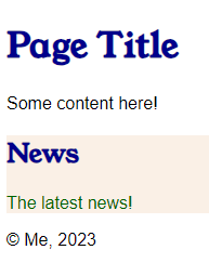
<div class="news-item">
    <h3>News item 1</h3>
    <p>Some news.</p>
</div>Code language: HTML, XML (xml)
You can add a second news item too after this one.
Flexboxes
Do you notice a problem with the way the news items are displayed?
Wouldn’t it be nice if the news boxes were next to each other? You could have a few of them across the screen. Only when the screen size is very narrow should they stack like this.
That’s where Flexboxes come in!
Let’s start by putting our news items inside a container <div>. We’ll give it the class “news-container”. Update the news section of page.html so it looks like below (changed parts highlighted):
<section class="news-section">
    <h2 id="news-title">News</h2>
    <p>The latest news!</p>
    <mark style="background-color:#f0f0f0" class="has-inline-color"><div class="news-container"></mark>
            <div class="news-item">
                <h3>News item 1</h3>
                <p>Some news.</p>
            </div>
            <div class="news-item">
                <h3>News item 2</h3>
                <p>Some news.</p>
            </div>
    <mark style="background-color:#f0f0f0" class="has-inline-color"></div></mark>
</section>Code language: HTML, XML (xml)
Now update style.css, adding the .news-container class and updating the .news-item class with a width.
.news-container {
    display: flex;
    flex-flow: row wrap;
    justify-content: space-around;
}

.news-item {
    background-color: var(--news-item-bg-color);
    <mark style="background-color:#f0f0f0" class="has-inline-color">width: 250px;</mark>
}Code language: JavaScript (javascript)
Save an reload page.html in the browser.
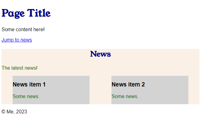
It’s that simple! Try adding even more news items and see what happens.
Let’s try something even better and add a banner to our page.
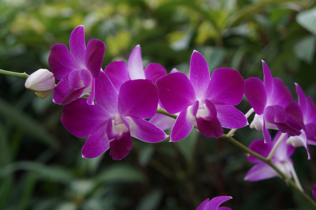
First you will need an image. You can right click the one below and save it or use your own. Save it into an images folder beneath your web page.
Add the following to your style.css:
.banner {
    background-image: url('../images/DSC00331-1024x680.jpg');
    background-size: cover;
    width: 100%;
    height: 70vh;
}Code language: CSS (css)
We are telling the browser which image to use, that we want it to cover the viewing area, and that the viewing area is 70% of the height and the width is 100% of the page.
Now add the following code to page.html just above </header>.
<div class="banner">
</div>Code language: HTML, XML (xml)
Reload and you will now see a big image on your page.
But wouldn’t it be nice if you could add something on top of that big image. Flexbox to the rescue!
In your style.css add a new colour variable under the :root element. We’re going to use RGB colour definition here because we want to change the opacity, which is the last value.
--banner-box-bg-color: rgb(256, 256, 256, 70%);Now, let’s change the .banner class and add a new .banner-box class.
.banner {
    background-image: url('../images/DSC00331-1024x680.jpg');
    background-size: cover;
    width: 100%;
    height: 70vh;
    display: flex;
    justify-content: center;
    align-items: center;
}

.banner-box {
    background-color: var(--banner-box-bg-color);
    text-align: center;
    padding: 20px;
}Code language: CSS (css)
Note how we’ve added the display: flex and aligned content to the centre.
In page.html update your banner code.
<div class="banner">
    <div class="banner-box">
        <h2>Banner Title</h2>
        <p>Banner text</p>
     </div>
</div>Code language: HTML, XML (xml)
Boxes within boxes! Refresh your browser and see the difference.

You could add in CSS a border-radius to give the banner box rounded edges or a width to make it wider. As you can see, many elements need padding, as we have removed it from the body element so that the banner image stretches the full width.
There are a lot of other things you can do with flexboxes and CSS. See A Complete Guide to Flexbox for more details.
Next we will look at CSS grids.
Complete code
styles.css
/** Styles */

/**
 * Define colours
 */

 :root {
    --main-bg-color: white;
    --main-text-color: black;
    --heading-color: darkblue;
    --news-bg-color: linen;
    --news-text-color: darkgreen;
    --news-item-bg-color: lightgrey;
    --banner-box-bg-color: rgb(256, 256, 256, 70%);
 }

/**
 * Define main elements
 */

body {
    font-family: 'Montserrat', sans-serif;
    background-color: var(--main-bg-color);
    padding: 0;
    margin: 0;
    color: var(--main-text-color);

}

h1, h2 {
    color: var(--heading-color);
    font-family: 'Young Serif', serif;
}

.news-section {
    background-color: var(--news-bg-color);
}

.news-section p {
    color: var(--news-text-color);
}

#news-title {
    text-align: center;
}

.news-container {
    display: flex;
    flex-flow: row wrap;
    justify-content: space-around;
}

.news-item {
    background-color: var(--news-item-bg-color);
    width: 250px;
}

.banner {
    background-image: url('../images/DSC00331-1024x680.jpg');
    background-size: cover;
    width: 100%;
    height: 70vh;
    display: flex;
    justify-content: center;
    align-items: center;
}

.banner-box {
    background-color: var(--banner-box-bg-color);
    text-align: center;
    padding: 20px;
}Code language: CSS (css)
page.html
<!DOCTYPE html>
<html lang="en">
<head>
<meta charset="utf-8" />
<title>Page Title</title>
<meta name="viewport" content="width=device-width" />
<link rel="preconnect" href="https://fonts.googleapis.com">
<link rel="preconnect" href="https://fonts.gstatic.com" crossorigin>
<link href="https://fonts.googleapis.com/css2?family=Roboto&family=Young+Serif&display=swap" rel="stylesheet">
<link rel="stylesheet" href="css/styles.css">
</head>
<body>
<header>
<!-- Header content, such as title, menu and banner -->
<h1>Page Title</h1>
<div class="banner">
<div class="banner-box">
<h2>Banner Title</h2>
<p>Banner text</p>
</div>
</div>
</header>
<main>
<!-- Main content -->
<section>
<!-- Divide the main content into sections -->
<p>Some content here!</p>
<p><a href="#news-title">Jump to news</a></p>
</section>
<section class="news-section">
<h2 id="news-title">News</h2>
<p>The latest news!</p>
<div class="news-container">
<div class="news-item">
<h3>News item 1</h3>
<p>Some news.</p>
</div>
<div class="news-item">
<h3>News item 2</h3>
<p>Some news.</p>
</div>
</div>
</section>
</main>
<footer>
<!-- Footer content -->
<p>© Me, 2023</p>
</footer>
</body>
</html>Code language: HTML, XML (xml)
You must be logged in to post a comment.